By Adil Hasan, Co-Founder at Phnix tech, with 10+ years managing and running app & website development company. Last updated: September 2026
Your website is often the first proper impression someone gets of your business, and most small business owners only find out what's missing after it's costing them customers. So let's save you the trouble. Over a coffee, here are the twelve things a small business website genuinely needs to earn trust, get found, and turn visitors into enquiries. No fluff, no jargon, just the stuff that actually moves the needle.
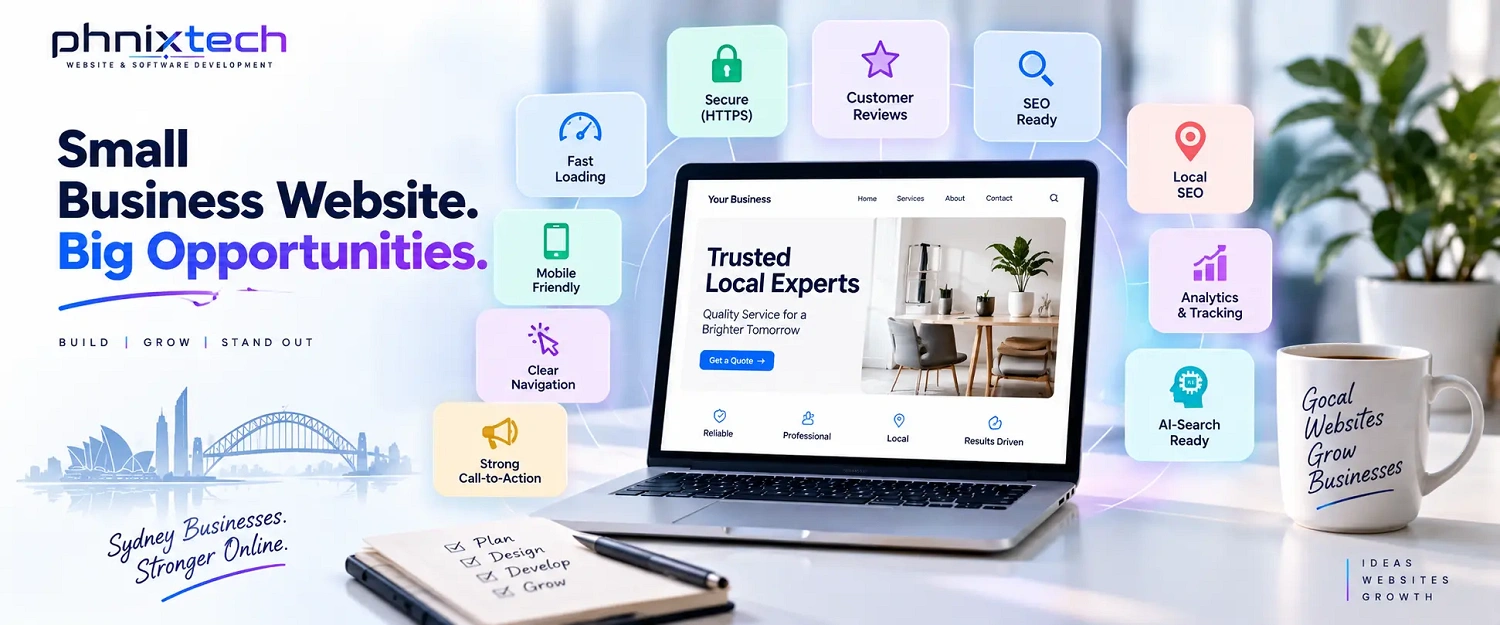
The must-have small business website features are: fast page speed, mobile-first design, clear navigation, an above-the-fold call-to-action, visible contact details, HTTPS security, customer reviews, dedicated service pages, SEO-friendly content with schema markup, analytics and conversion tracking, AI-search readiness, and local SEO signals. Get these twelve right and your site will load quickly, look good on any phone, build trust, show up in search, and give visitors an obvious reason and an easy way to get in touch. Now let's go through each one.
This is the least glamorous of the small business website features, and quietly one of the most important. If your pages are slow, people leave before they ever see what you offer. Google's own research (Google/SOASTA Research, 2018) found that as a page's load time goes from one second to three seconds, the chance of a visitor bouncing jumps by 32 percent. At five seconds it climbs to 90 percent. Core Web Vitals is simply Google's scorecard for how fast and stable your pages feel to a real person. You don't need to understand the technical side. You just need a site built to load quickly, with tidy code and properly sized images, so nobody gives up waiting. Speed is the foundation everything else sits on.
More than half of all web traffic worldwide now comes from mobile devices, according to StatCounter data via Statista (2026), and in plenty of markets it is far higher. Your customers are browsing on their phones, often standing in a queue or sitting on the couch. "Responsive design" just means your site automatically reshapes itself to fit whatever screen it's on, so it looks and works beautifully on a phone, a tablet, or a laptop. On top of that, Google now looks at the mobile version of your site first when deciding where to rank you. So a site that only looks good on a desktop isn't just annoying for visitors, it's actively holding back your search results too. Mobile isn't an afterthought anymore. It's the main event.
If people can't find what they're looking for in a couple of clicks, they leave. It really is that blunt. Good navigation means a clean menu with plain labels that say exactly what they are, like "Services," "About," and "Contact," rather than clever names nobody understands. Think about the handful of things most visitors want, and make those the easiest to reach. A confused visitor is a lost visitor, and every extra click or dead end is a chance for them to give up and try a competitor instead. When someone lands on your site, the path to what they need should feel obvious, almost invisible. If they have to stop and think about where to go next, the design has already tripped them up.
"Above the fold" is an old newspaper term for the part of the page you see before scrolling. On your website, that prime space needs to make one thing crystal clear: what you want the visitor to do next. Whether that's "Book a free consultation," "Get a quote," or "Call us today," the action should be right there, easy to spot, and hard to miss. Too many small business sites bury this, or leave visitors guessing. Don't make people hunt for the next step. Tell them plainly, give them an obvious button, and make it stand out from everything around it. One clear action beats five competing ones every time. Confused people don't convert, they leave.
You would be amazed how many websites make you dig around just to find a phone number. Don't be one of them. Your contact details, phone, email, and location, should be easy to find, ideally in the header, the footer, and on a dedicated contact page. On mobile, your phone number should be "click-to-call," meaning someone taps it and their phone just dials you. No copying, no typing, no friction. When a customer is ready to reach out, that is a warm, valuable moment, and the last thing you want is to lose them because they couldn't work out how to get in touch. Make contacting you the easiest thing on the whole site.
See the little padlock next to a web address? That means the site is secure. HTTPS (the technology behind that padlock) encrypts the connection between your website and your visitor, which protects any information they share. This matters for two reasons. First, Google confirmed HTTPS as a ranking signal back in 2014, and since 2018 its Chrome browser has openly flagged sites without it as "Not Secure." Second, that scary "Not Secure" warning sends visitors running, even if they don't fully understand it. For a small business, an SSL certificate is cheap, often free, and non-negotiable. It's a basic sign that you're legitimate and that you take your customers' safety seriously. Skipping it costs you both trust and rankings.
People trust other people far more than they trust your marketing, and the numbers back it up. BrightLocal's 2025 Local Consumer Review Survey found that only about 3 percent of consumers say they never read online reviews, and roughly seven in ten read them regularly when researching a local business. That means your reviews are doing sales work for you around the clock. Put genuine testimonials on your website, show off your star ratings, and link out to your Google reviews. Real names and real results are far more convincing than a generic "great service!" quote. Social proof turns a nervous first-time visitor into someone who feels safe picking up the phone. It's one of the cheapest trust-builders you have, so use it generously.
Cramming every service you offer onto a single page is a mistake on two fronts. It overwhelms visitors, and it wastes a big search opportunity. Each of your main services or product categories deserves its own page, where you can explain it properly, answer the questions people actually ask, and speak directly to someone looking for that specific thing. This also gives Google more clear, focused pages to show in search results, which means more ways for the right customers to find you. Someone searching for one particular service wants to land on a page about that service, not scroll through nine others to find the bit that matters to them. Give each offering room to breathe and to sell itself.
SEO sounds intimidating, but at its heart it just means writing your website so both people and search engines understand it clearly. That means using the words your customers actually type, answering their real questions, and structuring pages in a sensible way. Schema markup is a small piece of behind-the-scenes code that spells things out for search engines, telling them "this is a review," "this is a price," "this is our address," so they can display your information more richly in results. You won't see it on the page, but it helps you stand out in search. Good SEO is built into a site from the start, not bolted on later, and it's the difference between a website that just exists and one that actually gets found.
If you don't measure it, you're guessing. Analytics tools, most commonly Google Analytics 4 (GA4), show you how many people visit your site, where they come from, which pages they read, and where they drop off. Conversion tracking goes a step further and tells you how many visitors actually did the thing you wanted, like filling in a form or calling you. This is gold. It shows you what's working, what's quietly failing, and where your marketing money is best spent. Flying blind means you can't tell a page that's pulling in customers from one that's driving them away. Set this up from day one, so you're making decisions based on real numbers, not hunches.
Here's the one almost nobody talks about yet, and it's becoming a big deal. More and more people are getting answers from AI, whether that's Google's AI summaries at the top of search or a chatbot they ask directly. These tools pull answers from websites and quote them. To be the site that gets quoted, you need clear, direct answers to real questions written in plain language, ideally in short, self-contained chunks an AI can easily lift. That means proper headings that match how people ask things, and straight answers right underneath them, rather than burying the point three paragraphs deep. Getting this right now, while most of your competitors haven't noticed the shift, is a genuine head start. It's the same instinct as good SEO, just aimed at a new kind of search.
If your customers are nearby, local SEO is how you show up when they search. Three things matter most here. First, connect and link your Google Business Profile, the listing that shows your business on Google Maps and in local results. Second, embed a map on your contact page so people can see exactly where you are. Third, keep your NAP consistent, which is just a tidy way of saying your Name, Address, and Phone number should be identical everywhere they appear online. Mismatched details confuse both customers and Google. Nail these signals and you'll turn up when someone nearby searches for what you do, which for most small businesses is exactly the customer worth winning.
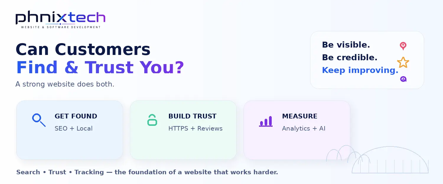
Run through this list against your own website right now. Tick the ones you've genuinely got covered, and be honest with yourself.
Counting your ticks? Ten or more and you're in great shape. Six to nine, and there's real money being left on the table. Five or fewer, and your website is likely working against you rather than for you.
If you have to pick one, mobile-first design and page speed are the two that underpin everything else. Among all the small business website features, these decide whether visitors stay long enough to see the rest. A slow site, or one that's awkward on a phone, loses people before your message, reviews, or offers ever get a chance.
Most small businesses do well with five to eight core pages: a home page, an about page, a contact page, and a dedicated page for each main service or product. Quality beats quantity here. A handful of clear, focused pages that each do one job well will always outperform a sprawling site full of thin content.
Not always. Live chat is helpful if you get lots of repeat questions or sell online, but it's not essential for everyone. If you can't reply quickly, a slow or ignored chat box does more harm than good. A clear contact form and an easy click-to-call number cover the basics for most small businesses just fine.
It varies with your needs, but most of these features are standard in any well-built small business website rather than pricey add-ons. A solid custom small business site in Australia typically starts from around $1,500 and rises with complexity. The key is that speed, security, and mobile design should be built in, never charged as extras.
If your self-audit turned up more gaps than you'd like, that's completely normal, and fixable. Our web design services build all twelve of these features in from the start, not as costly add-ons later. Full disclosure: this is what we do, so we're not a neutral bystander. But the checklist above is yours to use with anyone. When you want a hand, grab a free quote.